1. Quick start
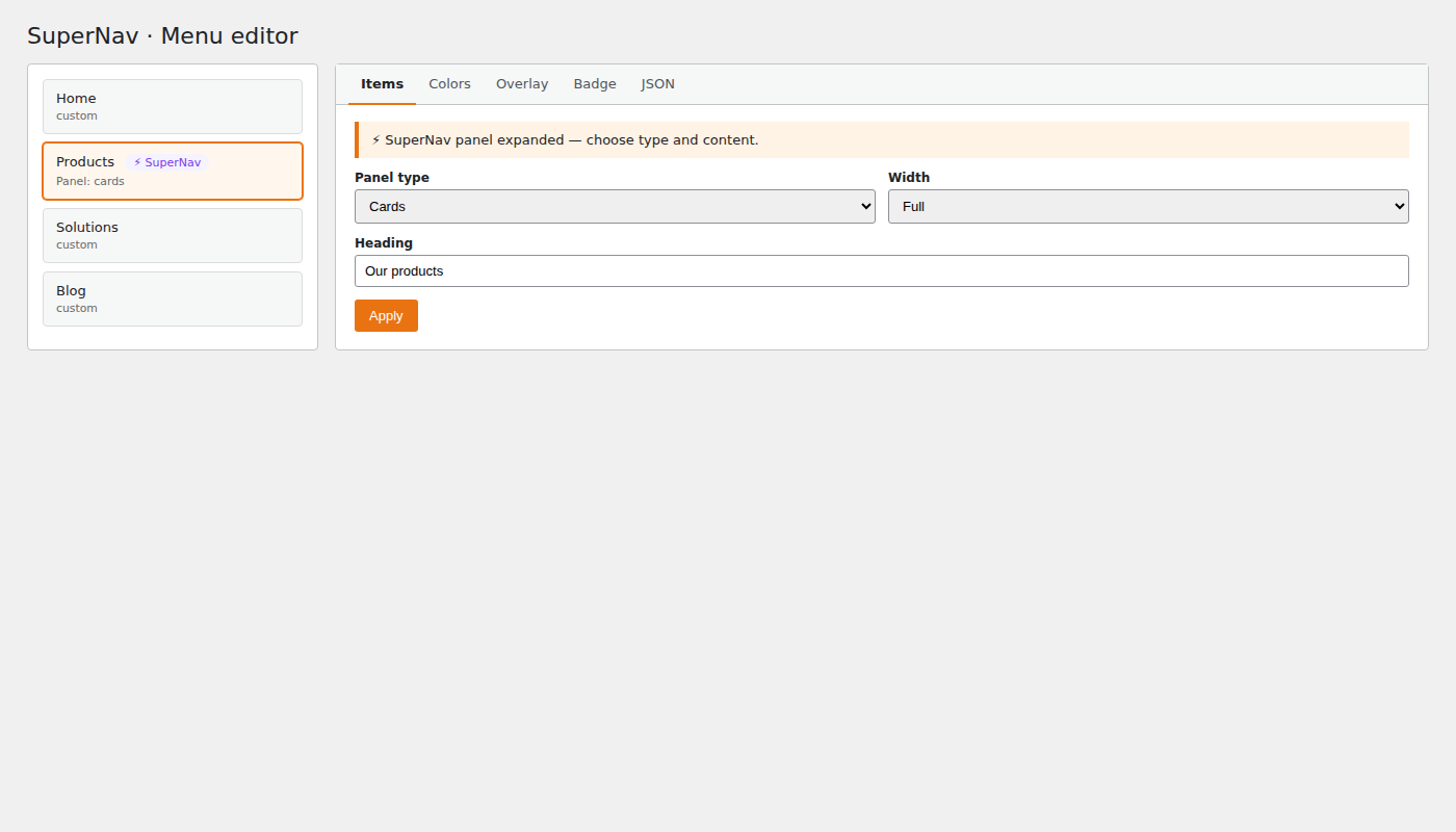
Open the menu editor
WordPress Admin → Appearance → Menus → select the desired menu
Expand a menu item
Click the arrow on a top-level entry
→ At the very bottom appears: ⚡ SuperNav Panel
Basic settings
| Field | Value for a features menu |
|---|---|
| Panel type | Columns with icons & descriptions |
| Panel width | Wide (~1100px) |
| "View all" text | View all features |
| "View all" URL | /features |
Save
Click "Save Menu" at the bottom right — only then do all changes take effect.
Visual builder: Columns, links, icons and badges can be edited via forms — JSON knowledge is optional. The JSON editor remains available for power users (Validate / Format / Load template).
Each menu item offers 6 panel types: Columns with icons & descriptions, Cards with images, Featured image + support links, Content (widgets/shortcodes), Auto (from WP submenu), and Shortcode/HTML.
2. Feature overview (Free)
- Mega menu panels — multi-column dropdowns per top-level item.
- Visual builder + optional JSON expert mode.
- 6 panel types — Columns, Cards, Featured, Content, Auto, Shortcode/HTML.
- Image swap — right-side image fades on item hover.
- Icons & badges — Dashicons, highlight badges, global filled/outline style, per-badge
"badge_outline": true. - Tag row — filter/category pills at the top of the panel.
- CTA/footer bar — label, links, optional
plain_links,right_html. - Sidebar groups — text links or image mode (
lmm_extra_mode). - Bottom links and configurable “View all” link.
- Responsive / mobile — hamburger, drawer or fullscreen, configurable breakpoint.
- Theme-independent — any theme using native
wp_nav_menu().
3. JSON structure: Columns & Links
The JSON content goes into the "Columns & Links" tab in the menu editor.
Minimal example (1 column, 2 items)
[
  {
    "heading": "Accounting",
    "items": [
      {
        "label": "Invoices",
        "desc": "Legally compliant and effortless invoicing",
        "url": "/invoices",
        "icon": "dashicons-media-document"
      },
      {
        "label": "Orders",
        "desc": "Create convincing quotes",
        "url": "/orders",
        "icon": "dashicons-email-alt"
      }
    ]
  }
]
Full example (2 columns + badge)
[
  {
    "heading": "Accounting",
    "items": [
      {
        "label": "Invoices",
        "desc": "Legally compliant and effortless invoicing",
        "url": "/invoices",
        "icon": "dashicons-media-document",
        "badge": "E-invoicing · Perfectly prepared",
        "badge_url": "/e-invoicing"
      },
      {
        "label": "Orders",
        "desc": "Create convincing quotes",
        "url": "/orders",
        "icon": "dashicons-email-alt"
      },
      {
        "label": "Receipt capture",
        "desc": "Collect all receipts in one place",
        "url": "/receipts",
        "icon": "dashicons-format-image"
      },
      {
        "label": "Banking",
        "desc": "Book incoming payments automatically",
        "url": "/banking",
        "icon": "dashicons-bank"
      },
      {
        "label": "Contact management",
        "desc": "All info on customers and suppliers",
        "url": "/contacts",
        "icon": "dashicons-groups"
      },
      {
        "label": "Products and services",
        "desc": "Maintain hourly rates and stock",
        "url": "/products",
        "icon": "dashicons-products"
      }
    ]
  },
  {
    "heading": "Taxes and reporting",
    "items": [
      {
        "label": "Overview",
        "desc": "Keep track of finances and tax load",
        "url": "/overview",
        "icon": "dashicons-dashboard"
      },
      {
        "label": "VAT return",
        "desc": "Pre-filled and sent directly to the tax office",
        "url": "/vat",
        "icon": "dashicons-chart-bar"
      },
      {
        "label": "P&L statement",
        "desc": "Effortless profit calculation on the side",
        "url": "/pnl",
        "icon": "dashicons-grid-view"
      },
      {
        "label": "Business evaluation",
        "desc": "Assess your company's performance",
        "url": "/evaluation",
        "icon": "dashicons-chart-area"
      },
      {
        "label": "Trial balance",
        "desc": "Trace journal entries in detail",
        "url": "/trial-balance",
        "icon": "dashicons-list-view"
      },
      {
        "label": "Exports",
        "desc": "DATEV and ADDISON compliant",
        "url": "/exports",
        "icon": "dashicons-download"
      },
      {
        "label": "Collaboration",
        "desc": "With your accountant or tax advisor",
        "url": "/collaboration",
        "icon": "dashicons-share"
      }
    ]
  }
]
4. Configuring colors
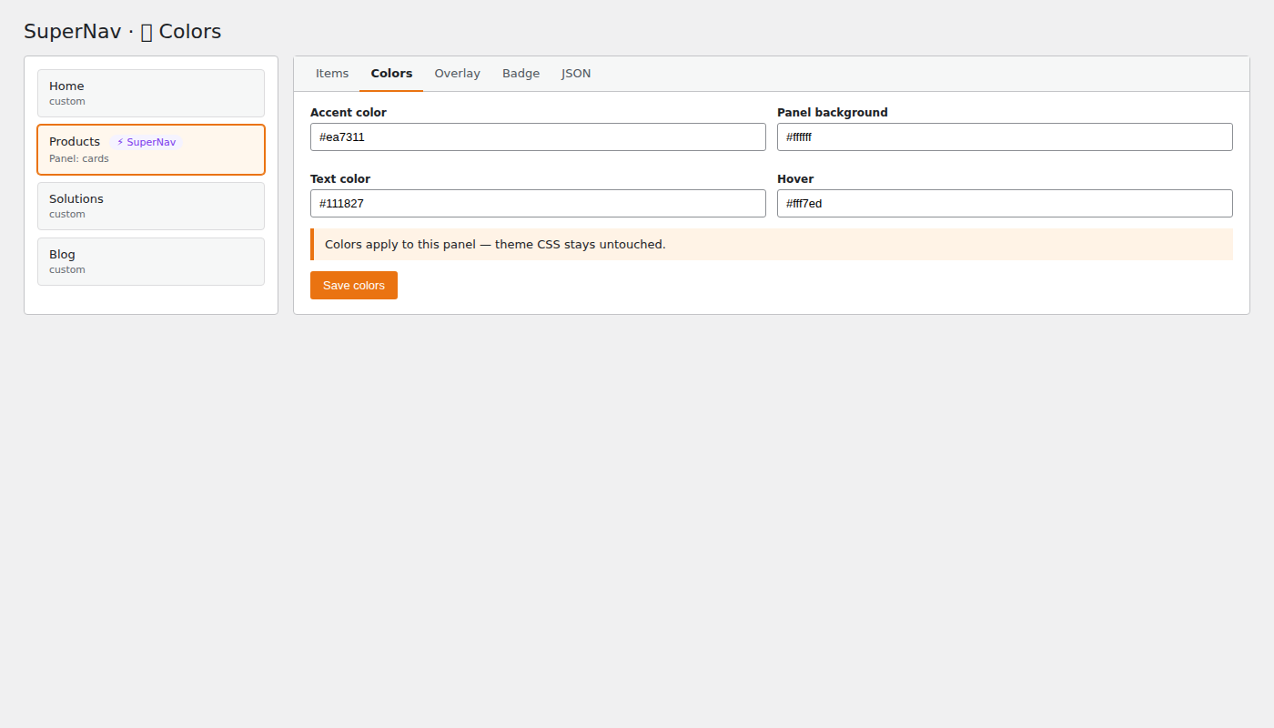
The plugin offers 4 levels of color configuration — from global down to a single item.
Level 1 — Global: plugin settings
WordPress Admin → Settings → SuperNav
Applies to all menu items. Color pickers for every area. No code required.
Level 2 — Per menu item: 🎨 Colors tab
In the menu editor → expand the menu item → tab 🎨 Colors
Overrides the global settings for this menu item only.
Leave empty = the global color is used.
Level 3 — Per column: JSON color fields
Directly in the column's JSON (heading level):
[
  {
    "heading": "Accounting",
    "bg_color": "#f0f9ff",
    "heading_color": "#0369a1",
    "icon_color": "#0369a1",
    "icon_bg": "#e0f2fe",
    "link_color": "#111827",
    "link_hover": "#0369a1",
    "desc_color": "#6b7280",
    "badge_bg": "#0284c7",
    "badge_text": "#ffffff",
    "border_radius": 10,
    "padding": 16,
    "items": [...]
  },
  {
    "heading": "Taxes and reporting",
    "bg_color": "#f0fdf4",
    "heading_color": "#166534",
    "icon_color": "#16a34a",
    "icon_bg": "#dcfce7",
    "items": [...]
  }
]
All column color fields:
| Field | Description | Example |
|---|---|---|
bg_color | Column background color | #f0f9ff |
heading_color | Color of the column heading | #0369a1 |
icon_color | Icon color in this column | #0369a1 |
icon_bg | Icon background in this column | #e0f2fe |
link_color | Link text color | #111827 |
link_hover | Link color on hover | #0369a1 |
desc_color | Description text color | #6b7280 |
badge_bg | Badge (pill) background | #0284c7 |
badge_text | Badge text color | #ffffff |
border_radius | Corner radius of the column in px | 10 |
padding | Inner spacing of the column in px | 16 |
Level 4 — Per item: JSON color fields
Directly on the individual item (items[] level):
{
  "label": "Invoices",
  "desc": "Legally compliant and effortless invoicing",
  "url": "/invoices",
  "icon": "dashicons-media-document",
  "item_bg": "#fef9c3",
  "item_color": "#92400e",
  "item_icon_color": "#d97706",
  "item_badge_bg": "#f59e0b",
  "badge": "NEW",
  "badge_url": "/invoices-new"
}
All item color fields:
| Field | Description | Example |
|---|---|---|
item_bg | Background color of the item | #fef9c3 |
item_color | Text color of the link | #92400e |
item_icon_color | Icon color of this item | #d97706 |
item_badge_bg | Badge color of this item | #f59e0b |
Priority of color levels
The most specific one wins — leaving a field empty always means: the next level up is used.
6. CTA bar
The CTA bar appears as a strip at the bottom edge of the panel.
"CTA bar" tab
{
  "label": "Free tools for the self-employed.",
  "links": [
    { "label": "E-invoice generator", "url": "/tools/e-invoice" },
    { "label": "Invoice generator",   "url": "/tools/invoice" },
    { "label": "All free tools",      "url": "/tools" }
  ]
}
7. Method B: directly via HTML
If you want maximum control or use a page builder:
<div class="lmm-panel-columns">
  <div class="lmm-cols-area">

    <!-- Column with background color -->
    <div class="lmm-col lmm-col--colored" style="background:#f0f9ff;--lmm-heading-color:#0369a1;border-radius:10px;padding:16px">
      <p class="lmm-col-heading">Accounting</p>
      <ul class="lmm-col-items">

        <!-- Item with badge -->
        <li class="lmm-col-item lmm-has-badge">
          <a href="/e-invoicing" class="lmm-badge-link">
            E-invoicing · Perfectly prepared
          </a>
          <a href="/invoices" class="lmm-col-link">
            <span class="lmm-col-icon"><span class="dashicons dashicons-media-document"></span></span>
            <span class="lmm-col-text">
              <span class="lmm-col-label">Invoices</span>
              <span class="lmm-col-desc">Legally compliant and effortless invoicing</span>
            </span>
          </a>
        </li>

        <!-- Item with its own background color -->
        <li class="lmm-col-item lmm-item--colored" style="background:#fffbeb;border-radius:8px;--lmm-icon-color:#d97706">
          <a href="/banking" class="lmm-col-link">
            <span class="lmm-col-icon"><span class="dashicons dashicons-bank"></span></span>
            <span class="lmm-col-text">
              <span class="lmm-col-label">Banking</span>
              <span class="lmm-col-desc">Book incoming payments automatically</span>
            </span>
          </a>
        </li>

      </ul>
    </div>

  </div>

  <!-- Sidebar -->
  <div class="lmm-panel-sidebar">
    <div class="lmm-sidebar-group">
      <p class="lmm-col-heading">Extensions</p>
      <ul class="lmm-sidebar-items">
        <li><a href="/integrations" class="lmm-sidebar-link">Integrations</a></li>
      </ul>
    </div>
    <div class="lmm-sidebar-bottom">
      <a href="/invoicing-software" class="lmm-all-link">Invoicing software →</a>
    </div>
  </div>
</div>
8. JSON field reference and tester
Column level ([] array objects)
| Field | Type | Required | Description |
|---|---|---|---|
heading | String | — | Column heading (UPPERCASE in the design) |
items | Array | ✅ | List of links |
bg_color | Hex | — | Background color of the column |
heading_color | Hex | — | Color of the heading |
icon_color | Hex | — | Icon color for all items of this column |
icon_bg | Hex | — | Icon background for all items of this column |
link_color | Hex | — | Link text color |
link_hover | Hex | — | Link color on hover |
desc_color | Hex | — | Description text color |
badge_bg | Hex | — | Badge background for all items of this column |
badge_text | Hex | — | Badge text color |
border_radius | Number | — | Corner radius in px (e.g. 10) |
padding | Number | — | Inner spacing in px (e.g. 16) |
Item level (items[] array objects)
| Field | Type | Required | Description |
|---|---|---|---|
label | String | ✅ | Link text |
url | String | ✅ | Target URL |
desc | String | — | Description line in gray |
icon | String | — | Dashicons class (e.g. dashicons-dashboard) |
image | String | — | Image URL (only for the "Cards" panel type) |
badge | String | — | Pill text above the item |
badge_url | String | — | Target URL of the badge |
item_bg | Hex | — | Background color of this item |
item_color | Hex | — | Text color of this item |
item_icon_color | Hex | — | Icon color of this item |
item_badge_bg | Hex | — | Badge color of this item |
Note: Always write hex colors with
#, e.g."#ef4444". Leaving a field empty ("") or omitting it = the parent color is used.
✓ JSON Tester
Validate and format your panel JSON right here — the editor turns green for valid and red for invalid JSON. No data is transmitted.
Live preview — this is how SuperNav renders this JSON:
9. CSS variables reference
All colors can also be overridden directly as CSS variables.
In Appearance → Theme Editor → style.css or Additional CSS:
:root {
  /* Navbar */
  --lmm-navbar-bg:      #ffffff;
  --lmm-navbar-height:  64px;
  --lmm-navbar-border:  #e5e7eb;

  /* Panel */
  --lmm-panel-bg:       #ffffff;
  --lmm-panel-border:   #e5e7eb;
  --lmm-panel-radius:   12px;
  --lmm-panel-padding:  32px;

  /* Colors */
  --lmm-heading-color:  #ef4444;
  --lmm-link-color:     #111827;
  --lmm-link-hover:     #ef4444;
  --lmm-desc-color:     #6b7280;
  --lmm-icon-color:     #ef4444;
  --lmm-icon-bg:        #fef2f2;
  --lmm-icon-size:      20px;
  --lmm-badge-bg:       #6366f1;
  --lmm-badge-text:     #ffffff;
  --lmm-all-link-color: #6366f1;
  --lmm-cta-bar-bg:     #f9fafb;
  --lmm-cta-bar-link:   #6366f1;
  --lmm-overlay-blur:   2px;
}
10. Plugin settings
WordPress Admin → Settings → SuperNav
| Setting | Description | Default |
|---|---|---|
| Activation mode | All menus or only specific positions | All menus |
| Open via | Hover or click | Hover |
| Open / close delay | ms until panel opens or closes | 50ms / 200ms |
| Colors | Global color pickers for all panels | — |
| Menu bar (Spacing & Shape) | Height, background (gradient = Pro/Launch advanced_style), padding, radius, item colors/hover, typography, spacing, borders, divider/glow, alignment, current item, focus color | — |
| Mega panel | Padding, CTA padding, radius, column padding, shadow, width (standard/wide/full), min. edge distance, fixed start position, manual offset | — |
| Dimming overlay | On/off, color, opacity %, blur 0–40px, separate open/close durations (0–2000ms, default 280ms). From 2.10.34: also fades when switching directly between menu items. Honors prefers-reduced-motion. | off |
| Panel fade in/out | Own open/close durations for the panel (0–2000ms, default 180ms each; Free from 2.10.35). Optional flip / 3D fold from top (from 2.10.36, default off) with adjustable flip angle 20–90° (default 70°, from 2.10.39). From 2.10.40: dynamic 3D perspective by panel height. No fade on mobile accordion. | 180ms / off / 70° |
| Flyout | Width, background, item text/hover for simple dropdowns | — |
| Mobile | Breakpoint, toggle bar (color/radius/disable), menu colors, item height, drawer style (drawer/fullscreen) | — |
| Default badge style | Global filled or outline | filled |
Seven tabs in the per-item mega panel editor: Columns & Links, Sidebar, CTA bar, Tag row, Featured, Content blocks, Colors (🎨). On narrow boxes the tab bar wraps instead of overflowing.
11. Theme compatibility
Lireno theme (lireno-latest)
The Lireno theme uses its own nav function. The following adjustment is needed in inc/landing-i18n.php:
// In the function taxbot_landing_wp_main_top_nav_parts()
// adjust the wp_nav_menu() call:
wp_nav_menu(
    array(
        'theme_location' => 'main-top',
        'container'      => false,
        'menu_class'     => 'tb-main-top-menu lmm-nav-container',
        'fallback_cb'    => false,
        'depth'          => 3,
        'walker'         => class_exists('LMM_Walker') ? new LMM_Walker() : null,
    )
);
And at the end of style.css:
/* SuperNav theme fix */
ul.tb-main-top-menu.lmm-nav-container {
    display: flex !important;
    align-items: center;
    list-style: none;
    margin: 0; padding: 0; gap: 4px;
}
ul.tb-main-top-menu.lmm-nav-container > li.lmm-has-mega,
ul.tb-main-top-menu.lmm-nav-container > li.lmm-has-dropdown {
    position: relative !important;
    list-style: none;
}
ul.tb-main-top-menu.lmm-nav-container > li.lmm-has-mega .lmm-mega-panel {
    position: absolute !important;
    top: 100% !important;
    left: 0 !important;
    margin-top: 4px;
    z-index: 9999 !important;
}
ul.tb-main-top-menu.lmm-nav-container > li.lmm-has-mega.lmm-align-right .lmm-mega-panel {
    left: auto !important;
    right: 0 !important;
}
Other themes
If the plugin does not respond (panel does not open), check in the theme's functions.php whether wp_nav_menu() sets its own walker. If so, use this AI assistant prompt:
The WordPress plugin "SuperNav" is not recognized in my theme.
The theme calls wp_nav_menu() in [FILE] with theme_location '[LOCATION]'.
Please add the walker parameter:
'walker' => class_exists('LMM_Walker') ? new LMM_Walker() : null
and extend menu_class with 'lmm-nav-container'.
12. Common problems
Panel does not open
- Panel type set to "No mega panel"? → Change to "Columns with icons & descriptions"
- Menu saved after the change?
- Browser console: document.querySelectorAll('.lmm-has-mega').length — must be > 0
- Plugin settings: set activation mode to "All menus"
Panel flickers
- Increase the close delay: Settings → SuperNav → Close delay → 300
- Check theme CSS for position: static !important on <li>
- Add the theme fix CSS to style.css (see theme compatibility)
Icons not visible
On pages rendering without wp_head(), Dashicons must be included via the theme filter taxbot_landing_lmm_head_html — see troubleshooting for the full code.
JSON errors (red marker)
- Only use double quotes ", no single quotes '
- No comma after the last item in an array
- Use the { } Format button — it shows syntax errors
- Or use the JSON tester on this site
Badge does not appear
Set at least "badge" (text). "badge_url" is optional and makes the badge clickable.
Colors not applied
Check the priority: item JSON > column JSON > 🎨 tab > plugin settings
Write hex colors correctly with #: "#ef4444" not "ef4444"
Panel too far right / left
The plugin detects edge overflow automatically. To force it manually:
/* Always left-aligned */
.lmm-has-mega .lmm-mega-panel { left: 0 !important; right: auto !important; }
/* Always right-aligned */
.lmm-has-mega .lmm-mega-panel { left: auto !important; right: 0 !important; }
Dimming overlay does not appear even though it is enabled
Most common cause: a theme with its own hard-coded .lmm-overlay CSS rule (often with !important, sometimes across multiple theme files or static HTML snapshots). In DevTools: does .lmm-overlay get class lmm-visible? Which computed background wins over var(--lmm-overlay-color)?
Mega panel editor tabs overflow the right edge
Affects older versions before the wrap fix — update to Core 2.10.35+.
13. Dashicons reference
Accounting & finance:
dashicons-media-document    → document/invoice
dashicons-bank              → banking
dashicons-money-alt         → money
dashicons-chart-bar         → bar chart
dashicons-chart-area        → area chart
dashicons-chart-line        → line chart
dashicons-list-view         → list
dashicons-grid-view         → grid
dashicons-download          → export/download

Contacts & people:
dashicons-groups            → customer groups
dashicons-businessman       → individual
dashicons-store             → shop
dashicons-email-alt         → email/orders

Navigation & system:
dashicons-dashboard         → overview
dashicons-admin-tools       → tools
dashicons-admin-plugins     → plugins/add-ons
dashicons-randomize         → integrations
dashicons-smartphone        → mobile app
dashicons-share             → collaboration
dashicons-format-image      → receipt capture
dashicons-products          → products
dashicons-sos               → help/support
dashicons-format-chat       → FAQ/chat
Full list: https://developer.wordpress.org/resource/dashicons/
14. Panel type: cards with images
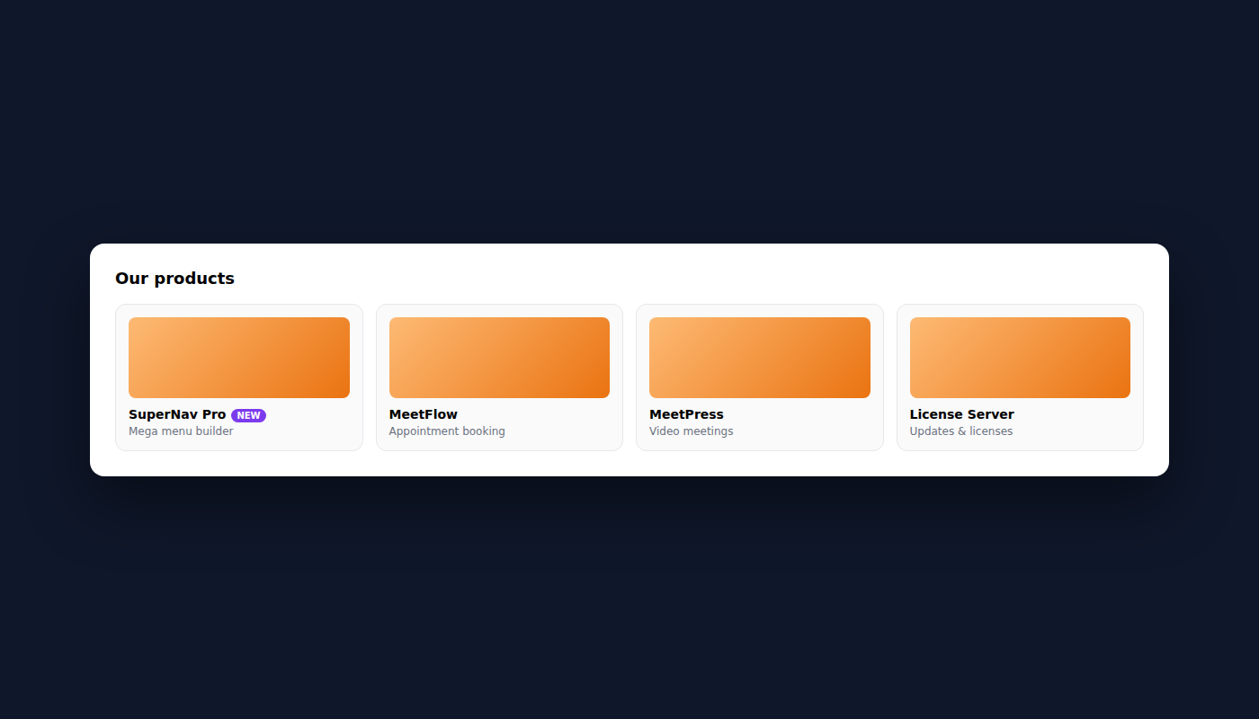
This panel type shows cards with real photos, title and description — ideal for target groups, solutions or industries.
Activation
In the menu editor → expand the menu item → Panel type: cards with images
JSON structure: "Columns & Links" tab
The cards go into the first array element under items[]. Every card needs an image field with the full image URL from the WordPress media library.
[
  {
    "heading": "Founding and business phases",
    "items": [
      {
        "label": "For founders",
        "desc": "Start your self-employment with digital accounting right away.",
        "url": "/founders",
        "image": "https://example.com/wp-content/uploads/founders.jpg"
      },
      {
        "label": "For sole proprietors",
        "desc": "Use your time wisely and rely on simple, clear accounting.",
        "url": "/sole-proprietors",
        "image": "https://example.com/wp-content/uploads/sole-proprietors.jpg"
      },
      {
        "label": "For companies",
        "desc": "Keep an eye on your finances and steer your company to success.",
        "url": "/companies",
        "image": "https://example.com/wp-content/uploads/companies.jpg"
      }
    ]
  }
]
Without an image: if no
imageis set, theiconfield is displayed as a Dashicon symbol instead. This way the panel can also be used without images.
Uploading images
Images come from the WordPress media library:
WordPress Admin → Media → Add New→ upload the image- Click the image → copy the URL from "File URL" on the right
- Paste this URL into the JSON as
"image": "..."
Recommended image size: 400 × 260 px (16:10 format), JPG or WebP
"Sidebar" tab — right column with groups
[
  {
    "heading": "For the self-employed",
    "items": [
      { "label": "For freelancers",      "url": "/freelancers",      "icon": "dashicons-desktop" },
      { "label": "For small businesses", "url": "/small-businesses", "icon": "dashicons-store" }
    ]
  },
  {
    "heading": "Starting a company",
    "items": [
      { "label": "Found an LLC online", "url": "/founding", "icon": "dashicons-flag" }
    ]
  },
  {
    "heading": "By industry",
    "items": [
      { "label": "Trades",       "url": "/trades",      "icon": "dashicons-admin-tools" },
      { "label": "Car workshop", "url": "/car-repair",  "icon": "dashicons-car" },
      { "label": "Gastronomy",   "url": "/gastronomy",  "icon": "dashicons-food" }
    ]
  }
]
Bottom links (arrow link at the bottom of the sidebar)
[
  { "label": "Discover all industries", "url": "/industries" }
]
Difference to "columns with icons"
| Aspect | Columns with icons | Cards with images |
|---|---|---|
| Image | No (icon only) | Yes (photo/graphic) |
| Layout | Horizontal link list | Grid of cards |
| Ideal for | Features, functions | Target groups, industries |
| Number of items | 5–8 per column | 2–4 cards |
| JSON field | icon | image (URL) |
15. Panel type: featured image + support links
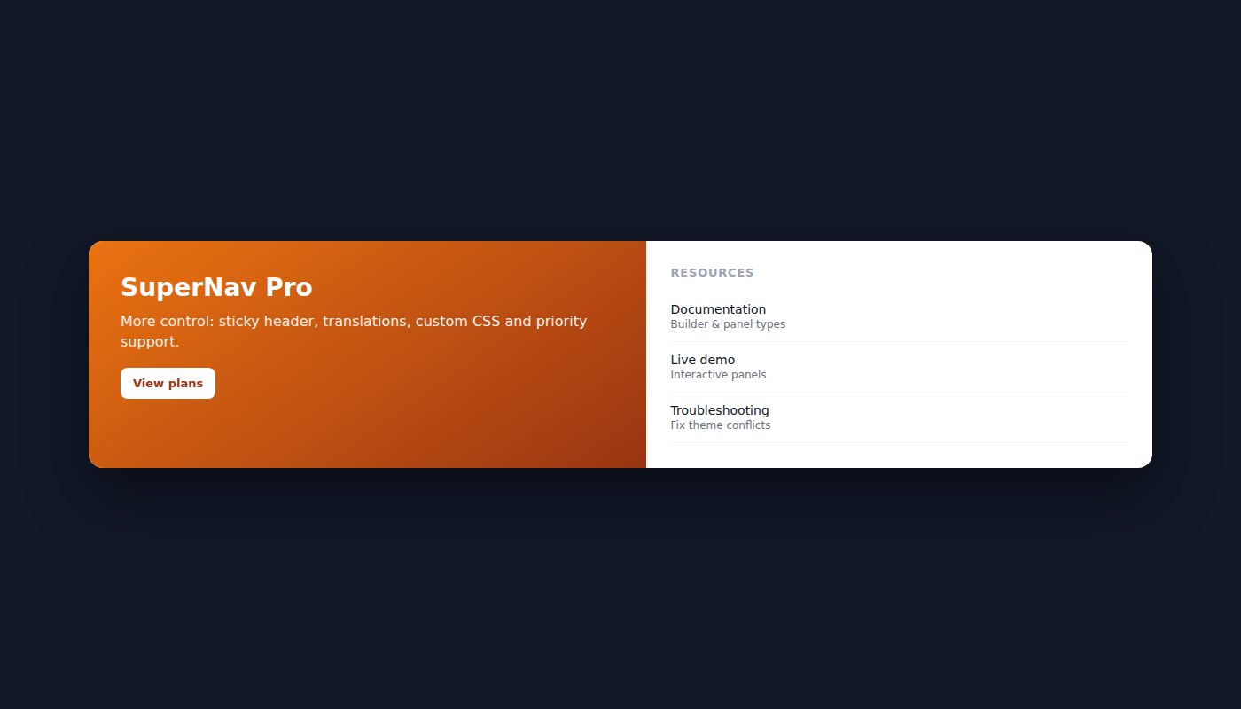
This panel type shows a team photo or illustration on the left and resource links on the right — ideal for service, support or contact menus.
Activation
In the menu editor → expand the menu item → Panel type: featured image + support links
"Columns & Links" tab — resource columns on the right
[
  {
    "heading": "Resources",
    "items": [
      {
        "label": "Guides",
        "desc": "Valuable knowledge about accounting and finance.",
        "url": "/guides",
        "icon": "dashicons-book"
      },
      {
        "label": "Founders' world",
        "desc": "From the idea to success in self-employment.",
        "url": "/founders-world",
        "icon": "dashicons-flag"
      },
      {
        "label": "Blog",
        "desc": "Interesting articles about self-employment.",
        "url": "/blog",
        "icon": "dashicons-edit"
      },
      {
        "label": "Free invoice template",
        "desc": "Templates for quotes, invoices, reminders.",
        "url": "/templates",
        "icon": "dashicons-media-document"
      }
    ]
  }
]
"Featured" tab — image + support links on the left
Image URL (required for the feature image):
https://example.com/wp-content/uploads/team.jpg
Support links (appear below the image):
[
  { "label": "Help center",               "url": "/help", "icon": "dashicons-sos" },
  { "label": "Frequently asked questions","url": "/faq",  "icon": "dashicons-format-chat" }
]
Recommended image size
- Format: square or 4:3
- Size: 280 × 280 px to 400 × 300 px
- Type: JPG or WebP, team photo or illustration
16. Multilingual (i18n)
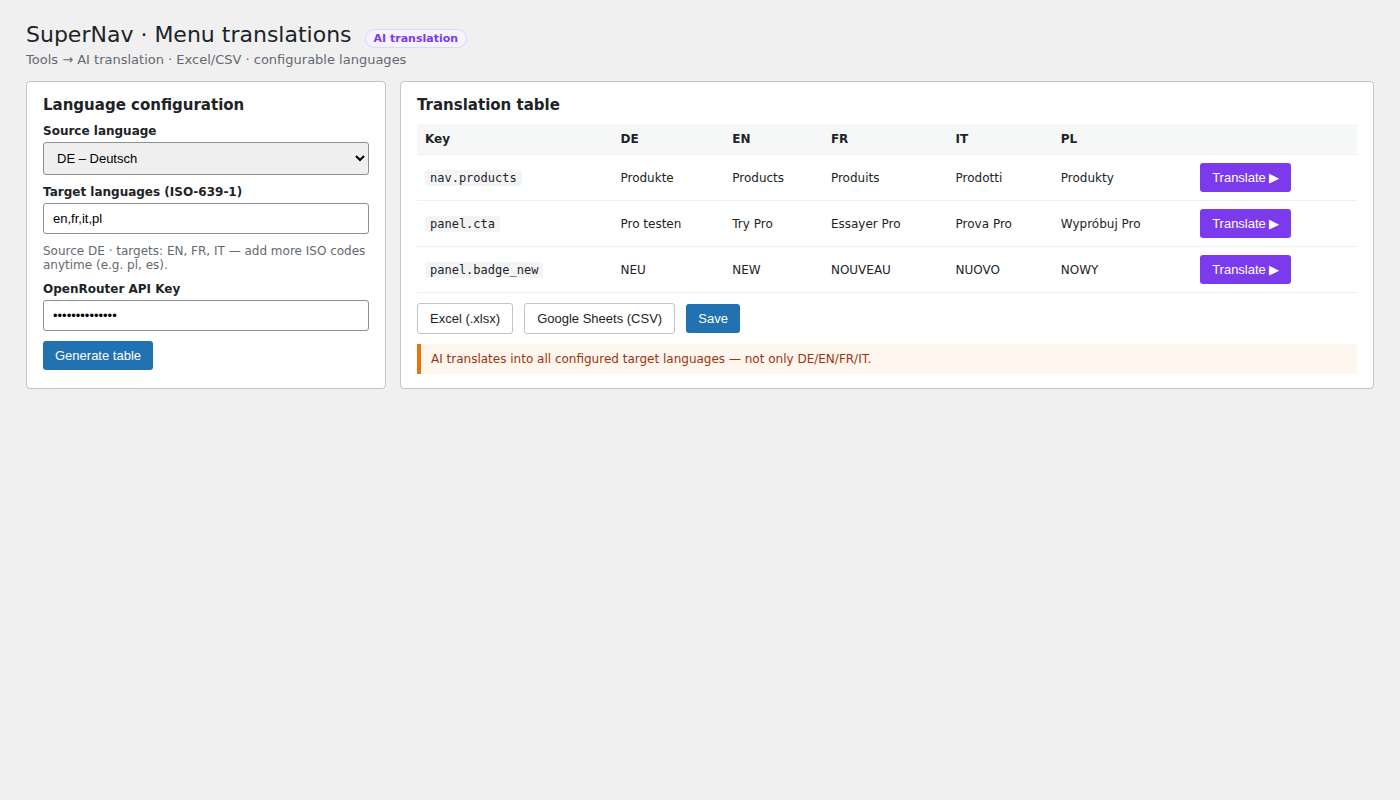
SuperNav multilingual support uses two systems. The translation module is included from plan Grow (also Scale; not in Free/Launch) and provides AI translation, Excel/CSV import/export and freely configurable target languages (ISO-639-1 — commonly DE/EN/FR/IT for Switzerland, but not limited to those).
Your own API key is required for AI: AI translation uses OpenRouter. Without a key, manual editing and Excel/CSV still work — AI buttons do not. KITech does not provide a key.
Set up the OpenRouter API key
- Create an account at openrouter.ai (or sign in).
- Under Keys, create an API key — typically
sk-or-…. Ensure your OpenRouter account has credits (billing is on OpenRouter). - In WordPress open:
Tools → Menu translations(Grow/Scale). Alternatively: SuperNav settings → Multilingual tab, if the module is embedded there. - In the Language config section, fill in the OpenRouter API Key field.
- Set source language and target languages (comma-separated ISO codes, e.g.
en,fr,it) and save (button Generate table / save language config). - Success: notice “OpenRouter API key is saved ✓”. Then per-row / batch AI buttons work. Without a key you see “No OpenRouter API key configured”.
The key is stored as WordPress option ksn_openrouter_api_key (not exposed on the frontend). API calls go to https://openrouter.ai/api/v1/chat/completions only when you actively translate.
System 1 — translating menu titles (🌐 field in the menu editor)
For the top-level menu items (e.g. "Features", "Solutions"):
Appearance → Menus→ expand the menu item- At the very bottom: 🌐 Translations (optional)
- Enter translations directly (e.g. EN/FR/IT):
🇬🇧 English:  Features
🇫🇷 Français: Fonctionnalités
🇮🇹 Italiano: Funzionalità
Save the menu. Leave empty = the WP navigation label (default language) is used.
System 2 — translating panel contents (Grow+: translation module)
For all texts inside the panel (column headings, labels, descriptions, badges, CTA …) — from plan Grow upward (also Scale; not in Free/Launch):
WordPress Admin → Tools → Menu translations- Language config: choose source language and enter target ISO codes (e.g.
en,fr,itor more such aspl,es) - Select the menu → Load — the module scans all JSON texts from SuperNav panels
- Edit texts manually or translate with AI (your own OpenRouter API key in the language config; only when you run a translation)
- Optional: export Excel/CSV → edit → import again
- Save
The module automatically creates keys for all texts:
| Context | DE reference | EN | FR |
|---|---|---|---|
| 0.heading | Buchhaltung | Accounting | Comptabilité |
| 0.items.0.label | Rechnungen | Invoices | Factures |
| 0.items.0.desc | Rechtskonform… | Legally compliant… | Conformément… |
| 1.heading | Steuern und Auswertung | Tax and Reporting | Fiscalité et Analyses |
Import/export workflow (recommended for many texts)
The fastest way to translate all panel texts:
Export
Tools → Menu translations- Select the menu → Load
- Click Excel (.xlsx) or Google Sheets (CSV)
- The file is downloaded with all source texts as reference
Translate
- AI translation directly in the module (per row or batch) — requires your own OpenRouter API key
- Or: fill target columns in Excel/Sheets (according to your configured languages)
- Or: translate the exported file externally (DeepL/ChatGPT) and re-import
Import
- Upload the translated file under Choose file
- Select the mode: Merge (keep existing keys) or Replace
- Click Import from file
- Done — all translations are active immediately
Important: re-scan after menu changes
If you change JSON contents in the menu editor (new items, changed labels), click Load again in the module to capture the new texts.
Activating a language
The language is controlled via the ?lang= URL parameter (or your existing language switcher), matching the configured ISO codes:
https://example.com/?lang=de   → German (default)
https://example.com/?lang=en   → English
https://example.com/?lang=fr   → French
https://example.com/?lang=it   → Italian
https://example.com/?lang=pl   → Polish (example of an additional target)
Configuring languages
Source and target languages are freely selectable in the module (ISO-639-1). Typical presets:
| Market / setup | Example targets |
|---|---|
| CH (Switzerland) | en,fr,it (source often DE) |
| DE / AT | en or more as needed |
| International | any ISO codes, e.g. en,fr,it,pl,es |
Overview: what is translated where
| Element | System | Where to configure |
|---|---|---|
| Menu titles | 🌐 field | Menu editor → menu item |
| Panel headings | Menu translations module | Tools → Menu translations |
| Item labels | Menu translations module | Tools → Menu translations |
| Item descriptions | Menu translations module | Tools → Menu translations |
| Badge texts | Menu translations module | Tools → Menu translations |
| Sidebar links | Menu translations module | Tools → Menu translations |
| CTA bar | Menu translations module | Tools → Menu translations |
17. Sidebar styling: icons, colors & typography
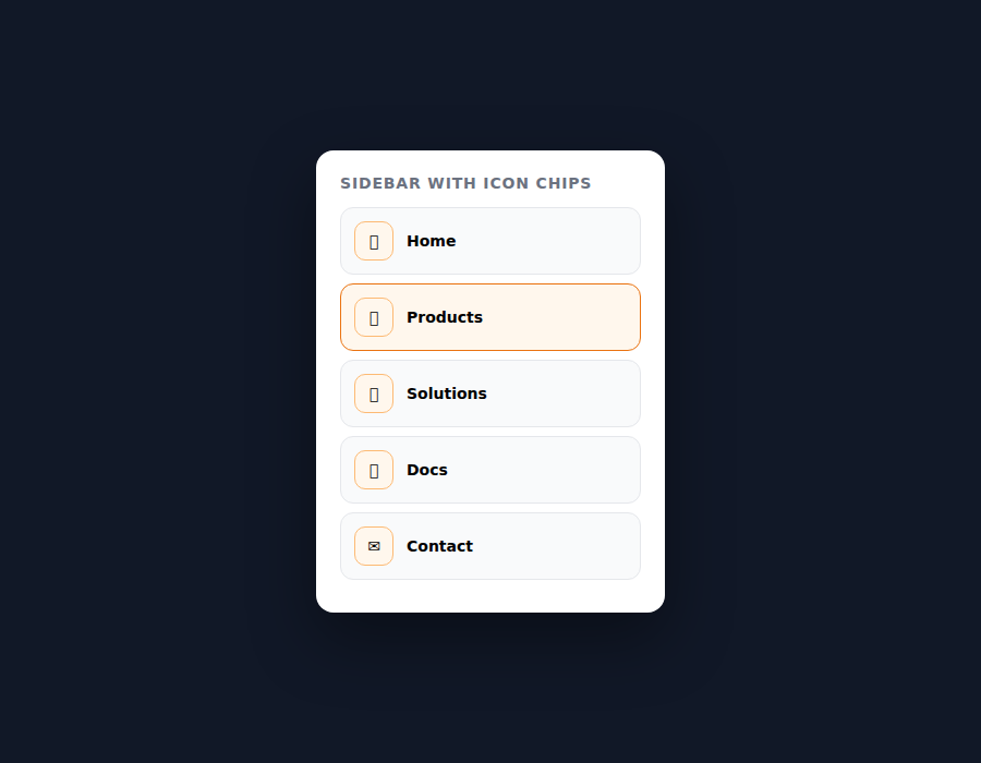
The sidebar (right column in the panel) can be customized in two ways:
Method A — via JSON (recommended, per sidebar group)
In the "Sidebar" tab of the menu editor:
[
  {
    "heading": "Extensions",
    "bg_color": "#f5f3ff",
    "heading_color": "#7c3aed",
    "link_color": "#4c1d95",
    "link_hover": "#7c3aed",
    "icon_color": "#7c3aed",
    "icon_bg": "#ede9fe",
    "font_weight": "600",
    "items": [
      {
        "label": "Integrations",
        "url": "/integrations",
        "icon": "dashicons-randomize"
      },
      {
        "label": "Add-ons",
        "url": "/addons",
        "icon": "dashicons-admin-plugins"
      },
      {
        "label": "Mobile app",
        "url": "/app",
        "icon": "dashicons-smartphone"
      }
    ]
  }
]
All sidebar group color fields:
| Field | Description | Example |
|---|---|---|
bg_color | Background color of the group | #f5f3ff |
heading_color | Color of the group heading | #7c3aed |
link_color | Link text color | #4c1d95 |
link_hover | Link color on hover | #7c3aed |
icon_color | Icon color | #7c3aed |
icon_bg | Icon background | #ede9fe |
font_weight | Font weight | 400 / 500 / 600 / 700 |
border_radius | Corner radius of the group in px | 10 |
padding | Inner spacing in px | 16 |
Method B — via CSS (global for all sidebars)
The CSS goes at the very end of Appearance → Theme Editor → style.css:
/* ── Sidebar styling ─────────────────────────────── */

/* Background of the whole sidebar */
.lmm-panel-sidebar {
    background: #f5f3ff;
    border-radius: 10px;
    padding: 16px !important;
    margin-left: 20px !important;
}

/* Sidebar heading */
.lmm-panel-sidebar .lmm-col-heading {
    font-size: 11px;
    font-weight: 700;
    letter-spacing: .08em;
    color: #7c3aed;
}

/* Sidebar links — font, color, weight */
.lmm-panel-sidebar .lmm-sidebar-link {
    font-size: 14px;
    font-weight: 600;
    font-family: 'Satoshi', sans-serif;
    color: #4c1d95;
    gap: 10px;
}

/* Sidebar link hover */
.lmm-panel-sidebar .lmm-sidebar-link:hover {
    color: #7c3aed;
    background: rgba(124, 58, 237, 0.08);
}

/* Sidebar icons */
.lmm-panel-sidebar .lmm-sidebar-link [class^="dashicons"] {
    color: #7c3aed;
    font-size: 16px;
}

/* Bottom links (arrow links) */
.lmm-sidebar-bottom .lmm-all-link {
    font-size: 13px;
    font-weight: 700;
    color: #7c3aed;
}

.lmm-sidebar-bottom .lmm-all-link:hover {
    background: rgba(124, 58, 237, 0.07);
}
Combining methods A + B
Recommendation: method A for colors per sidebar group, method B for global font settings (font-size, font-family, font-weight) that should be the same everywhere.
Full example: sidebar with all options
[
  {
    "heading": "Extensions",
    "bg_color": "#f0fdf4",
    "heading_color": "#166534",
    "link_color": "#14532d",
    "link_hover": "#16a34a",
    "icon_color": "#16a34a",
    "icon_bg": "#dcfce7",
    "font_weight": "600",
    "font_size": 14,
    "font_family": "'Satoshi', sans-serif",
    "font_style": "normal",
    "letter_spacing": 0.02,
    "text_transform": "none",
    "border_radius": 10,
    "padding": 14,
    "items": [
      {
        "label": "Integrations",
        "url": "/integrations",
        "icon": "dashicons-randomize",
        "color": "#166534"
      },
      {
        "label": "Add-ons",
        "url": "/addons",
        "icon": "dashicons-admin-plugins"
      },
      {
        "label": "Mobile app",
        "url": "/app",
        "icon": "dashicons-smartphone"
      }
    ]
  }
]
Tip: Not all fields have to be set — leave them empty and the global setting is used. Only set the fields that should differ from the default.
Per-item color (single link)
With "color" a single link can get a different color:
{
  "label": "Integrations",
  "url": "/integrations",
  "icon": "dashicons-randomize",
  "color": "#dc2626"
}
18. Dimming & panel animation
Path: Settings → SuperNav → Mega menus → Spacing & Shape. Dimming and panel animation are two independent effects with their own timings — both are Free (no Pro license required).
Dimming overlay
Option: “Dim the rest of the page while a panel is open”.
- Color and opacity (0–100%)
- Blur 0–40px
- Open duration and close duration separately in ms (0–2000, default 280 ms each) — soft opacity transition; 0 = instant. Recommended: 150–400 ms. Honors
prefers-reduced-motion.
Switching between menu items (Core 2.10.34+): When a visitor moves directly from one open mega menu to another (e.g. quick hover from “Features” to “Solutions”), the background dim fades out and back in briefly — instead of staying dark throughout the switch. Uses the same open/close durations as above; no separate setting; automatic when dimming is enabled.
The plugin drives CSS variable --lmm-overlay-color. Themes must not override .lmm-overlay with a fixed background: … !important or desktop display: none.
Panel animation (Core 2.10.35+)
Section “Panel fade in/out” directly under the dimming overlay. The open mega panel / dropdown itself fades in and out (instead of hard show/hide) — independent of the background dim, with its own timing.
- Open duration: 0–2000 ms, default 180 ms
- Close duration: 0–2000 ms, default 180 ms
- 0 = no transition (instant). Recommended: 120–300 ms.
Applies to mega panels and simple dropdowns alike. On mobile (accordion view) there is intentionally no fade — panels still open/close immediately.
Flip effect / 3D fold (Core 2.10.36+)
Optional checkbox in the same “Panel fade in/out” section:
- “Flip effect: open the panel like a folding board (3D flip from the top instead of a plain fade)” — default: off
- Uses the same open/close durations as panel animation (0–2000 ms) — no separate flip-only timings.
- Automatically disabled when the browser/OS has Reduce motion (
prefers-reduced-motion) enabled — then normal fade without 3D.
Flip angle (Core 2.10.39+): number field 20–90°, step 5°, default 70° (CSS variable --lmm-panel-flip-angle). At a full 90°, most of the panel surface stays nearly invisible during the rotation and only “unfolds” at the end — that feels like a sudden jump, regardless of the open/close duration. A smaller angle (e.g. 60–70°) keeps more of the motion visible and makes the animation softer.
Smooth flip on tall panels (Core 2.10.40+): 3D perspective is calculated per panel from its actual height (instead of a fixed 1400 px). Short and tall menus open equally smoothly.
19. Admin & developer tools
- Admin header — logo, version/license status, docs links, Upgrade to Pro.
- Clear cache — with timestamp of last clear.
- Reset settings — deletes saved configuration.
- Safe mode — emergency stylesheet with black/white contrast; shows all mega panels at once. Banner at page bottom while active. Applies to all visitors — use only temporarily for debugging.
- License management — Freemius (product ID
33524), Free / Launch / Grow / Scale. - Per-item panel colors (Colors tab) — optionally override globals for one menu item.
20. Pro plans: Launch / Grow / Scale
| Tier | Features |
|---|---|
| Free | Core (builder, panel types, overlay …) — without translation module |
| Launch | Sticky menu, custom menu logo, search box, role-based visibility, advanced styling (incl. menu bar gradient) |
| Grow | Everything in Launch + translation module (AI translation, Excel/CSV import/export, configurable target languages), auto-panels from subpages, map block in content panels (Google Static Maps; placeholder without API key), free custom CSS editor |
| Scale | Everything in Grow + white-label (hide plugin branding) + up to 25 websites (Freemius license quota; not unlimited) |
Billing (Freemius, USD)
Two paths — features per tier are identical; only billing differs. Details & checkout: Upgrade to Pro.
| Path | Plan | Sites | Price |
|---|---|---|---|
| Lifetime (one-time) | Launch Lifetime | 1 | $ 147 |
| Grow Lifetime | 5 | $ 297 | |
| Scale Lifetime | 25 | $ 796 | |
| Annual | Launch | 1 | $ 49 / year |
| Grow | 5 | $ 99 / year | |
| Scale | 25 | $ 199 / year |
Privacy: The free version does not contact external services by itself. The Pro map block requests images from Google Static Maps API (only with your own Google API key). Pro AI translation calls OpenRouter only when you actively translate — and only with the OpenRouter API key you configured.
21. Version history
Current plugin release: 2.10.56 (released ). Highlights below — full changelog in the plugin readme.txt. Release dates are package dates (ISO YYYY-MM-DD).
| Version | Released | Changes |
|---|---|---|
| v2.10.56 | Root-cause fix: _lmm_panel_colors was saved as [] instead of {} when colors were left empty, permanently “poisoning” the field — PHP now encodes an object; JS self-heals already affected menu items (Free) | |
| v2.10.55 | New color field “Card image background (on hover)” in the menu editor under the 🎨 Colors tab (per menu item, not global) — leave empty to keep default #f3f4f6 (Free) | |
| v2.10.54 | Child items of a mega-panel parent (e.g. product cards) no longer incorrectly appear on the top menu level as well (Free) | |
| v2.10.53 | Card image background transparent by default; gray area only on hover (Free) | |
| v2.10.52 | Card image distorted/cropped for square logos (object-fit:cover → contain) (Free) | |
| v2.10.51 | Card icons invisible (missing font-family: dashicons) (Free) | |
| v2.10.50 | Card image was saved in the backend but not shown on the frontend (wrong JSON key) (Free) | |
| v2.10.49 | Invisible flyout text fixed (CSS specificity conflict with theme styles) (Free) | |
| v2.10.48 | Solute/Elementor bug report: fatal error with empty menu location, duplicate dropdown arrows, invisible mega panel due to stacking-context conflict (Free) | |
| v2.10.47 | Fix desktop mega panel: multi-column panels clipped text on the right — .lmm-cols-area gets min-width:0 so columns share available width (Free) | |
| v2.10.46 | Fix desktop mega panel: long icon-badge labels were cut mid-word — badges constrained to column width with ellipsis overflow (Free) | |
| v2.10.45 | Fix mobile accordion: large gap between menu item and content — drawer links no longer use height:100% of the expanded row (Free) | |
| v2.10.44 | Fix mobile accordion: panel as a block under the link instead of a floating flex column; reset desktop top/left/overflow in the drawer (Free) | |
| v2.10.43 | Fix mobile drawer: reparent to <body> so theme backdrop-filter/transform cannot shrink the drawer (Free) | |
| v2.10.42 | Fix: separate desktop vs drawer menu copies (positioning, flip, sticky); resize listener leak fixed (Free) | |
| v2.10.41 | Fix: mega panel no longer bleeds past the right viewport edge (full width without 100vw scrollbar issue; standard/wide shrink when tight) (Free) | |
| v2.10.40 | Flip effect: 3D perspective derived from panel height — smooth open on tall menus (Free) | |
| v2.10.39 | Adjustable flip angle 20–90° (default 70°) for a softer 3D fold (Free) | |
| v2.10.38 | Fix: flip effect was invisible because position correction forced inline transform:none | |
| v2.10.37 | Filter lmm_frontend_config for themes without wp_head(); no duplicate lmm-nav-container class | |
| v2.10.36 | Optional flip effect (3D fold from top) for panel open; honors prefers-reduced-motion | |
| v2.10.35 | Mega panel itself fades in/out; separate panel open/close durations (independent of overlay; Free) | |
| v2.10.34 | Dimming overlay also fades when switching between menu items (Free) | |
| v2.10.33 | Overlay open/close durations split into two fields | |
| v2.10.32 | Overlay fade durations made configurable | |
| v2.10.31 | Overlay fades softly on open and close | |
| v2.10.29 | Removed leftover debug code (performance; no user-facing change) | |
| v2.10.26 | Real Freemius credentials active (product ID 33524) | |
| v2.10.25 | Dimming overlay configurable in the backend (was hard-coded before) | |
| v2.10.16 | Configurable minimum distance from screen edge for mega panels (Spacing & Shape); full-width stays edge-to-edge | |
| v2.10.14–15 | Panel positioning fixed (anchor to menu item, not the whole nav) and edge clamping simplified | |
| v2.10.13 | Freemius SDK bundled — active from v2.10.26 with product ID / public key | |
| v2.10.10–11 | CTA footer padding; safe default panel width (image-card panels no longer slide off-screen) | |
| v2.10.3–6 | Safe-view mode (“I can’t see anything”); universal edge clamp for mega panels | |
| v2.10.0–1 | 3-tier licensing (Launch/Grow/Scale); CTA plain_links and right_html | |
| v2.9.8 | Mobile Toggle Designer; Custom CSS editor (Grow+) | |
| v2.7.0 | Interactive preview with panel positioning; i18n / translation integration | |
| v2.6.0 | License key field; menu alignment; Pro-gated search box | |
| v2.5.0 | Tabbed settings (General, Menu Bar, Mega Menus, Flyout, Mobile, Multilingual, Tools) | |
| v2.4.0 | Menu bar styling; accessibility improvements | |
| v2.3.0 | Admin header quick links; Tools (cache/reset); mobile accordion | |
| v2.2.0 | Free/Pro licensing abstraction; per-column/item colors via JSON | |
| v2.1.0 | Content panel type; colors tab; keep-open for interactive panels | |
| v2.0.0 | Visual JSON builder; robust hover; automatic panel positioning | |
| v1.0.0 | Initial release |
SuperNav v2.10.56 — a product by KITech